Part 6 : AX SRS Reporting: Sample report scenario – Creating an AX SSRS Report with AX Query having SYS Query parameters only

Hi,

In this post we will walk through creating a sample report:

1. The report will be using an AX query for its data.

2. It will have query ranges as parameters (Sys Query parameters / Query contracts).

Pre-Requisite:

1. AX 2012 should be installed with Reporting extensions

2. SSRS should be installed.

3. VS tools should be installed

Let’s get started.

Creating the data source query

Since our report will use an AX query as data source type. We will first create the AX query. In this example we will use SalesTable to display the invoices details. We will use SalesId, DeliveryDate & SalesStatus as Query range parameters.

Open Dynamics AX development environment

1. Create a new project. I name it as “SysQueryOnlyRpt”.

2. In Project Right Click New –> Query.

3. A query gets added. Go to properties and change the name. I keep it as “SysQueryOnlyRptQry” .

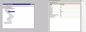
4. Expand the Query node and on Data sources right click –> New Data source.

5. A data source get added. In properties window set Table property to Sales Table. Rename the Data source name to SalesTable also.

6. Expand the SalesTable, click on Fields node. In Properties set the Dynamics Propery to “Yes” from “Unselected”. This will show you all the fields now.

7. In the Ranges node right click –> New Range.

8. A Range field will get added. In the properties window set the Field to “SalesId” Column.

9. Repeat steps 7-8 to add two more ranges on field “SalesStatus” and “DeliveryDate”.

Our AX Query is now created and ready. Save the project.

6-1

Creating the project:

First, we will create a project.

1. Open Visual Studio.

2. Click File -> New Project.

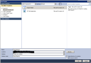
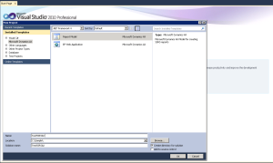
3. New Project dialog opens. Click on Dynamics AX on left hand side menu and Report Model on Right hand side.

4. Give a name to the project. I will name it as “Query Reports” (as I will keep all query related reports in this project). Give a location also.

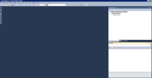
5. Click OK. A project is created

6-2

6-3

Create the Report

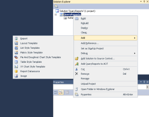
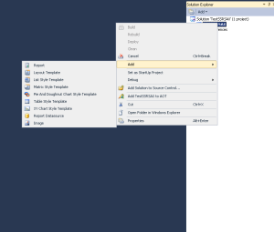
1. In the project created above right click Add –> Report

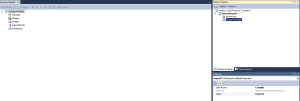
2. A report gets added. Rename that. I name it “SysQueryOnlyRpt”

6-4

6-5

3. In the report designer (Left hand side. Right click on Datasets à New Dataset.

4. In the properties window of newly created dataset:

  • Set the name of data source. I will name it as “SyQueryOnlyRptDS”.
  • Set the Data Source to “Dynamics AX”
  • Set the Data source type to “Query”
  • Ensure that the Default Layout is set to table. This is needed to create the auto design layout as table when we drag and drop the dataset.
  • Ensure that Dynamic Filters is set to yes. This will ensure that the ranges we added in query are represented as Query contract (with Query dialog form) and not as individual UI parameters.
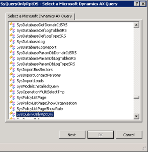
  • In the Query Property click on ellipsis. A new Dialog should open. This dialog should list all the queries in AX. Select the one we created above for this report (SysQueryOnlyRptQry). Click Next.

6-6

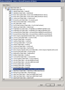
  • We should see list of fields, field groups, and Display methods available in query. For simplicity we will select SalesId, SalesNane, CustAccount, InvoiceAccount, CurrencyCode & SalesStatus (Label).

Note: Since SalesStatus is an AX enum there are two fields (One for the name of the enum and other for the label). We can choose either one (if that suffices our requirement) or choose both. In our case we just need to show the label so we can choose only one. In cases where you want to do filtration at report side you will need the name field too. We will look at this in future post.

6-7

  • Click ok. The fields would now be imported to dataset.

6-8

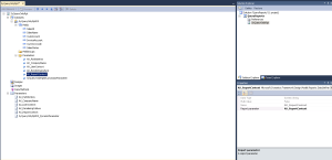
Note: You should see many parameters added in the dataset parameters node.

  • SyQueryOnlyRptDS_DynamicParameter : This is a parameter for the AX query that we have added.
  • AX_PartitionKey: Framework added parameter for passing Partition key.
  • AX_CompanyName: Framework added parameter for passing Legal entity id.
  • AX_UserContext: Framework added parameter for passing user context values.
  • AX_RenderingCulture: Framework added parameter for passing user AX rendering culture.
  • AX_ReportContext: Framework added parameter for passing Report context values.

The same parameters would also be found under the “Parameters” node. If you look at properties of parameters under the “Dataset(SyQueryOnlyRptDS)” node you will notice that each of them is related the parameters under “Parameters” node. This is how the relationship is established. You cannot have a parameter under “Dataset(SyQueryOnlyRptDS)”node which is not related to a parameter under “Parameters” node.

Warning: Please avoid changing properties or deleting the Framework related parameters and/or Dynamics parameter.

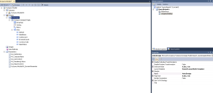
5. We can now drag the Dataset (SyQueryOnlyRptDS) on the “Designs” node. This will create a Autodesign for the report. In the properties window :

  • Set the name. I set it as “AutoDesign”.
  • Set the layout template as “ReportLayoutStyleTemplate”.

6-9

  • Expand the Autodesign node and under that click the “SyQueryOnlyRptDSTable” node. In properties window set Style Template as “ReportStyleTemplate”.
  • You can move the fields up and down either by using controls on the menu or using Ctrl + UP/Down Arrow.

6. The report is now ready.

Save and deploy

The Report when created is saved to AOT in AX. But we will add the Project to AOT also. We will then deploy and test the report.

1. Build the Project

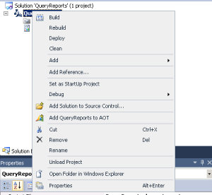
2. Right click the report project (QueryReports) in solution explorer à Add “QueryReport to AOT”. Wait and you should see a message at bottom of VS as “Add to AOT succeeded”.

6-10

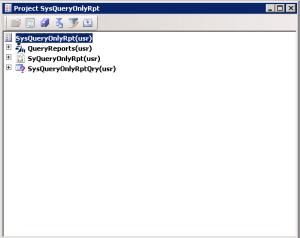
3. Open AX development environment and open the project we have created (SysQueryOnlyRpt).

4. From AOT Under “Visual Studio Projects” –> “Dynamics AX Model Project”. Drag the “QueryReports” project and add to the AX project (SysQueryOnlyRpt).

5. From AOT Under “SSRS Reports” –> “Reports”. Drag the “SyQueryOnlyRpt” report and add to the AX project (SysQueryOnlyRpt).

6-11

6. Now right click on the “SyQueryOnlyRpt” in the project and Deploy. For prerequisite and deployment steps (also common errors) for any report please refer to this post.

7. We should get and info log for report deployed successfully.

View the report

For viewing the report we need to create a menu item bind it to the report. The menu item then can be used in menus, forms etc.

1. In the project (SysQueryOnlyRpt) we had created. Right click and New –> Menu Item

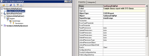
2. In properties window:

    • Give a name. I name it as SysQueryOnlyRpt.
    • You can give a label to it. I am just hardcoding this for now. I set it to “Sample Query report with SYS Query”   Note: For development purposes please create a label in label file and mention that here.
    • Set a help text (again should be a label). I am leaving it blank.
    • In Object Type, Select “SSRS Report” from the drop down
    • In Object, select the report (SysQueryOnlyRpt) from the dropdown.
    • In ReportDesign, select AutoDesign from the dropdown.

6-12

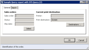
3. Now right click on the menu item and click ok. You should see an dialog.

6-13

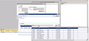
4. You can see that the 3 ranges we added are shown as query ranges. Click on select and it should open another query form dialog, where we can set range values for filtration. Right now we will not set anything so click ok on SYS query dialog.

6-14

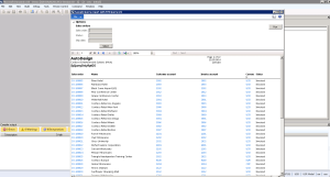
5. On the dialog click OK. Another dialog will open and the report will render.

6-15


You can now change the query ranges and play around and test the report to see if filtration works.


Hope this helps. In next post we will walkthrough more scenario(s).

– Girija


Disclaimer

Part 5 : AX SSRS Reporting: Report Development IDE

Hi,

In this post, let us walk through basics of AX SSRS Reports development IDE.


Pre-Requisite:

  1. AX 2012 should be installed with Reporting extensions
  2. SSRS should be installed.
  3. VS tools should be installed

For detailed installation and deployment please follow the detailed MSDN article.


Creating an AX SSRS Report Project

Below are the steps to create a project:

  1. Open Visual Studio.
  2. Go to File à New Project. A dialog opens
  3. Select Microsoft Dynamics AX on left hand side menu, on right hand pane select Report Model.
  4. Give a name and select a Location. Click Ok. This should create the project

IDE 1

5.  To add a Report , Right click on project –> Add –> Report

IDE 2

6. Your report should be added now.

IDE 3


Report Development IDE Explained

Once you have added a report in a Report project you should see the following on the left hand side as shown in the screenshot above. These are:

  1. Datasets: Any dataset(s) that are used in report. A single report can have one or more data sets from one or more sources.
  2. Designs: Any design(s) that are used in the report. A report can have one or more designs.
  3. Images: Any Image(s) that are used in report. Can Zero or more.
  4. Data Methods: Any C# data methods that are used by report. Can be Zero or more.
  5. Parameters: Any parameters that are used by report. These contains default framework parameters, Query parameter, Contract parameters, and UI parameters.

– Girija


Disclaimer

Part 4 : AX SSRS Reporting: Fundamentals of AX SSRS Reports development framework

Hi,

In this post we will walk through some basic concepts/terms for Dynamics AX SSRS reporting.

Report types definition

Broadly speaking reporting in AX 2012 can be classified into two types of reporting:

  1. AX SSRS: Typically reports that are transactional in nature and consume data from Dynamics AX (through AX Query, RDP etc.) for data are referred to as AX SSRS reports.
  2. AX OLAP: Typically reports that are analytical in nature and consume data from AX cubes (by MDX queries) are referred to as AX OLAP

Let’s go through them in detail:

In AX 2012 SSRS reporting there is a new framework available that developers have to use to create and run reports. Let’s go through some of the terms that we will be frequently using:

  1. Query: Typically refers to AX query in case of AX transitional reports.
  2. Report Data Provider (RDP): X++ data class used in AX SSRS reporting which can be used to retrieve data, process business logic.

Base class is “SrsReportDataProviderBase”. Any class that is defined as a Data Provider class for a report should inherit from this base class.

  1. Query Contract: This is the query lookup in report dialog that shows the query ranges. This is handled internally by framework.
  2. Report Data Contract (RDP contract): X++ class containing parameters definitions to be used by RDP for parameter value processing to be used in RDP business logic.

Any class defined as a contract should have the “[DataContractAttribute]” on top of class definition and “[DataMemberAttribute (<ParameterName>)]” on top of parameter properties.

  1. RDL Data Contract: X++ class that can be used to access and modify design level parameters used in the report that are not part of RDP contract.

Base class is “SrsReportRdlDataContract”. Any class defined as controller class should inherit from the base class.

  1. Report Controller: A class that can be used to control the report execution and validation. These classes can also be used to control the dialog and validations before & after the dialog is shown.

Base class is “SrsReportRunController”. Any class defined as controller class should inherit from the base class.

  1. UI Builder: X++ class that can be used to design a report parameter dialog for custom look and feel. The same can be sued for any event handling that is required on the report dialog. Also can be used for adding custom lookups to the parameters too.

Base class is “SrsReportDataContractUIBuilder”. Any class defined as controller class should inherit from the base class.

  1. Data Methods: A C# method that can be used in report data sets. This can contain retrieval mechanism logic as well as processing of business logic.
  2. Enum Provider: An extension provided by framework which can retrieve the name/label data for an AX Enum.


In AX OLAP reports the only way of retrieving data is using MDX query. The MDX query is the same as used in SQL Server Analysis Services cubes. Detailed language reference for MDX can be found in MSDN.

– Girija


Disclaimer

Part 3 : AX SSRS Reporting : Data sources & types

Hi,

In Dynamics AX 2012 there are multiple data sources and data source types supported. In this post we will walk through them.

Data sources

AX 2012 SSRS reports supports two data sources. Data sources options are:

  1. Dynamics AX
  2. Dynamics AX OLAP

Dynamics AX:

This data source should be used if data is to be retrieved from Dynamics AX. There are various sub types (data source types) which can be used. In this option the data retrieval mechanism connects to the Dynamics AX instance and retrieves data.


Dynamics AX OLAP:

This data source should be used if data is to be retrieved from Dynamics AX cubes. In this option MDX query can be used to retrieve the data. In this option the data retrieval mechanism connects to the Dynamics AX cubes deployed on a SQL Server Analysis service (SSAS) instance and retrieves data.


Data source types


AX 2012 SSRS reports supports multiple data sources types. Data source types are used to define how the data is accessed in AX SSRS report from AX system. The options available are:

  1. Query
  2. Report Data provider
  3. Business Logic
  4. Enum Provider


The data source type to data source mapping is listed below:

  Dynamics AX Dynamics AX OLAP
Query Supported Supported
Report Data Provider Supported Not Supported
Enum Provider Supported Not Supported
Business Logic Supported Not Supported


Query

A Query data source type is used if all the data retrieval logic can be achieved through a query.

In case of data source being Dynamics AX it will be an AX query (AOT query) or in case data source is Dynamics AX OLAP it will be MDX query. Typically this is the most efficient way of retrieving data. In case of AOT queries the tables (used in the AOT query) fields & Display Methods can be used for data retrieval.

In case of data source being Dynamics AX OLAP, a MDX query has to be written to retrieve the data. The MDX query can have parameters as well.

Report Data Provider

A Report Data Provider data source type is used when there is some business logic that you want to add after retrieving the data.

Not the most effective way of retrieving data but if logic has to be run this will be used.

Business Logic

A Business logic is typically used when you want to access a data source other than Dynamics AX / Dynamics AX OLAP. This is also used for drill through to forms.

Not the efficient way to retrieve data. Should be avoided where ever possible.

Enum Provider

An Enum provider is used when the requirement is to retrieve the values/label for an AX Enum. This is typically used to populate drop down selection in parameters.

Should be used to populate Enum parameter drop downs.


This MSDN article also mentions some parameters to consider before choosing a data source type.

– Girija


Disclaimer

Part 2 : AX SSRS Reporting : Deployment

Hi,

Continuation of my post on SSRS reporting,  in this post I would cover reports deployment in AX 2012.

In AX 2012 reports need to be deployed to Report server for user to be able to generate and view them. In this post we will cover the process and ways to deploy an AX SSRS reports. So lets get started.

Pre-Requisite:
1. AX 2012 should be installed with Reporting extensions
2. SSRS should be installed.
For detailed installation and deployment please follow the detailed MSDN article.

Deployment of Reports
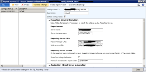
Before you start the deployment of reports on Report Server please verify the configuration. To do so you can navigate to the following path in AX client:
System Administration — Setup — Business Intelligence — Reporting Services — Report Servers

xasca

Few things to check here:
1.  Check the URL (http://<servername>/Reports && http://<serverName>/ReportServer ) are running and accessible by browser.
2.  Click on the Validate Settings. If everything is good you should get success. If it throws an error :
a) If error is like “Ensure that reporting services is configured ….” : Please check the SSRS configuration and make sure it is up and running.
b) If error is like “The folder Dynamics AX was not found on the reporting server at the URL …” : In this error please click on the “Create Report Folder” button on the above form and create the folder. This will create the folder on Report Server.

There are two ways to deploy the reports:

1. AOT
2. PowerShell

1. To deploy report manually from AOT follow these steps:

a) Open AOT in AX development environment.
b) Expand the “SSRS Reports” node. Then expand the “Reports” node under it. This will contain all reports.
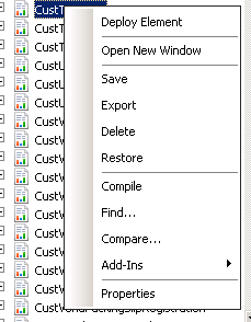
c) Navigate to the report you want to deploy. In this case I will deploy “CustTransList” Report. You can select more than one report also in the AOT.
d) Right click the selected reports and click “Deploy Element”

edhdhbfdbh

e) If deployed successfully you should get the success info log, else error (in case of any error).

2. To deploy reports through PowerShell follow these steps:

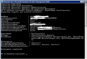
a) In the server go to Start  Administrative tools  Microsoft Dynamics AX 2012 Management Shell. This opens a PowerShell window and imports some namespaces.
b) In the console you can write the command “Publish-AXReport –ReportName <ReportName(s)>”. The ReportName(s) can be one report AOT name or multiple report AOT names (comma separated). In this example we will deploy CustTransList report, so command will be “Publish-AXReport –ReportName CustTransList”. Press enter.

vsvsvsvs

Note:  In cases where UAC is enabled we might get error for “UAC enabled …” In those cases please open AX Client or PowerShell (Whatever you are using for deployment) as administrator.

– Girija


Disclaimer

Part 1 : AX SSRS Reporting : Introduction

Hi,

In the very first post  of the series will cover the basic of SSRS reporting.

In AX 2012 (all versions and releases) SQL Server Reporting Services is used as basic reporting platform. The architecture is quite different from the last version (AX 2009) and is much more flexible and supports a lot more data retrieval mechanism. The programming model is also enhanced to cater to the various scenarios and report types.

For understanding and developing reports in AX 2012, a good to have pre-requisite would be:

1. SSRS reporting development

3. AX knowledge

2. X++

Reporting Architecture

The reporting architecture is very clearly explained in this MSDN article. I will not go into detailed explanation of the architecture but two quick basic points to keep in mind would be:

  1. There is a custom extension that is used for data retrieval. So essentially this extension is same as any other out-of-box extension that SSRS already has (e.g.: SQL Server, SQL Server Analysis Services, Oracle, etc…). This extension gets available when we install Reporting services extensions using the AX 2012 Setup.
  2. Services are available which ensure the connectivity between SSRS server and AX. The specific service is “Services”. This can be found in AX client under System Administration->Services and Application Integration Framework->Inbound ports. Note: Always ensure that this service is deployed and running.

I will cover the deployment in the next article.

– Girija


Disclaimer

WinJS appbar – tabbed control with listview

Hi,

As the title for the post suggest I am going through building a sample for WinJS appbar that acts as a tabbed control. Typically what I am going to do here is similar to what the default Weather app or News app has in app bar.

So here is the overall scenario
1. Create a app bar with three buttons (One each for “Birds”, “Animals” and “Reptiles). When the app bar opens it will show these three buttons.
2. On clicking any button, the app bar will extended showing a list of items. The items will be a collection of names for the button selected. For example if “Birds” is selected, the list will show “Ostriches”, “Penguins” etc. , if “Animals” is selected then the list would show “Tiger”, “Lion” etc. and so on.
3. On clicking the current button again, the list should hide itself.
4. On hide of app bar the app bar should go to default state, i.e. all items should be collapsed.

Simple requirement. Lets start 🙂

Since we are only demonstrating the app bar, I would create a new project (Blank application). In Visual Studio –> New Project –> JavaScript –> Windows Store Apps –> Blank App. Give it some name.

A project gets created with a default.html file. I usually prefer the light shade. So I would change the reference to ping to ui-light.css.

<link href="//Microsoft.WinJS.1.0/css/ui-light.css" rel="stylesheet" />

We need to have some data for the collections. So we will add a javascript file under js folder. I have named it data.js (You can name it otherwise also). First we would add the link in default.html to this new created file.

<script src="/js/data.js"></script>

In the data.js we will declare a namespace for the App bar data. In this sample I use static sample data. You may choose to get that from any service and create the data.
For this sample I need three lists 9one each for three categories. I also have a method for populating the data. I declare all of them in this namespace. this helps me to call the Properties or methods from anywhere in the app.

In below code :

      BirdData : Property for Binding List containing list of Bird names.


      AnimalData: Property for Binding List containing list of Animal names.


      ReptileData: Property for Binding List containing list of Reptile names.


    CreateAppBarData : Method for creating the initial data and assigning to above properties.
WinJS.Namespace.define("AppBarData",
        {
            BirdData: null,
            AnimalData: null,
            ReptileData: null,
            CreateAppBarData: initializeData
        });

Now we will have the implementation for the “initializeData” method. As I mentioned I use static data. So it is a simple implementation for me.

function initializeData() {
        var birdsdata = [{ title: "Ostriches" }, { title: "Kiwis" }, { title: "Penguins"}, { title: "Parrots"}, { title: "Storks"}];
        var animaldata = [{ title: "Tiger"}, { title: "Lion"}, { title: "Giraffe"}, { title: "Whale"}, { title: "Penguins"}];
        var reptilesData = [{ title: "Aligators"}, { title: "Crocodiles"}, { title: "Turtle"}, { title: "Lizard"}, { title: "Snakes"}];

        AppBarData.AnimalData = new WinJS.Binding.List(animaldata);
        AppBarData.BirdData = new WinJS.Binding.List(birdsdata);
        AppBarData.ReptileData = new WinJS.Binding.List(reptilesData);
    }

We are done with data.js. We have created the properties and methods for creating the data for our app bar.

Now lets go and complete the HTML. For the app bar to be two layered we need to divide it into two rows. First row would contain the parent buttons (One each for “Birds”, “Animals” and “Reptiles”) and for the second row we would use a control. Things to watch out here is that the first row would be always be visible and second row would hide and show based on the toggle state of the category in first row. We will handle most of them in CSS.

In HTML we would add a div for app bar and make it align to top. In the app bar we would add three divs (one for each category) and add a listview also.

For each category button we would have a for the title and and two divs (one for up arrow and other for down arrow).

<div class="appBarSample" data-win-control="WinJS.UI.AppBar" aria-label="Navigation Bar"
        data-win-options="{layout:'custom',placement:'top'}">
        <header class="navbar">
            <div class="itembirds item">
                <h3 class="overlay">Birds</h3>
                <div class="upArrow">▲</div> <!-- Data is amphashx25B2; (convert the amp and hash to symbols) -->
                <div class="downArrow hidden">▼</div> <!-- Data is amphashx25BC; (convert the amp and hash to symbols) -->
            </div>
            <div class="itemanimals item">
                <h3 class="overlay">Animals</h3>
                <div class="upArrow">▲</div> <!-- Data is amphashx25B2; (convert the amp and hash to symbols) -->
                <div class="downArrow hidden">▼</div> <!-- Data is amphashx25BC; (convert the amp and hash to symbols) -->
            </div>
            <div class="itemreptiles item">
                <h3 class="overlay">Reptiles</h3>
                <div class="upArrow">▲</div> <!-- Data is amphashx25B2; (convert the amp and hash to symbols) -->
                <div class="downArrow hidden">▼</div> <!-- Data is amphashx25BC; (convert the amp and hash to symbols) -->
            </div>
            <div class="navbarlist hidden win-selectionstylefilled" data-win-control="WinJS.UI.ListView"
                data-win-options="{ selectionMode: 'none' }"></div>
        </header>
    </div>

We also need to add a template for the list view item. It is a simple template just displaying the title.

<div class="itemtemplatelist" data-win-control="WinJS.Binding.Template">
        <div class="item">
           <h4 class="title" data-win-bind="textContent: title"></h4>
        </div>
    </div>

We are done with the HTML. Now lets turn to the CSS. where bulk of the work is handled.
In CSS we will first define the layout for the appbar. As described we would need two rows. I will go for a grid layout for this sample.

In default.css, define the “navbar” to a grid layout with two rows and 4 columns. I would set the first row to a fixed size and the second row to a “auto” size. This is because when I want to hide the contents, the height should go to 0 and when I show the contents it should take the height of the elements in it. For the columns I would have one column for each category and the last one taking the rest space.

.navbar {
    -ms-grid-rows: 100px auto;
    -ms-grid-columns: 150px 150px 150px 1fr;
    display:-ms-grid;
    background-color: gray;
}

Now I would place the category divs in their location as per my grid layout.

.navbar .itembirds {
        -ms-grid-column:1;
        -ms-grid-row:1;

    }

    .navbar .itemanimals {
        -ms-grid-column:2;
        -ms-grid-row:1;
    }

    .navbar .itemreptiles {
        -ms-grid-column:3;
        -ms-grid-row:1;
    }

I would put the list view in the second row and make it streatch to all available width and height. I would give it a height because the second row was set to auto. This is because when the list view is shown it will show as height of 70px and when hidden the height would be 0px.

.navbar .navbarlist {
        -ms-grid-row:2;
        -ms-grid-column:1;
        -ms-grid-column-span:7;
        background-color: lightgray;
        height: 70px;
    }

For hiding and showing elements I use a class approach. I add a “hidden” class name to elements that need to be hidden and remove this when the elements need to be shown. By using so, I don’t need to handle them in JavaScript. All I need to do is add/remove this class and rest is taken care of. So I would define the hidden class in CSS.

.navbar .hidden {
        display:none;
    }

I would do the styling and layout for the category items and the list view items. I am not going through all of them. You can get the styles from the full code shared at the end of this article.

Now we jump on to the code part. We would do all the code in default.js.

First we need to create the data. For this in app activated event after processing the UI we will call the method we created in data.js. Then we will call a method to initialize the app bar for us.

args.setPromise(WinJS.UI.processAll().done(function(x)
            {
                AppBarData.CreateAppBarData();// this method populates the data
                initializeAppBar(); // Start initializing the app bar
            }));

We need to have a variable to track which button is selected currently. We would add a string variable for the same.

var currentSelected = "";

We will add a small helper method for hiding/showing elements. This code just adds/removes the hidden class based on whether the element is to be shown or hidden. Rest as discussed earlier is taken care by CSS.

function showHideElement(element, show) {
        if (show) {
            if (WinJS.Utilities.hasClass(element, "hidden")) {
                WinJS.Utilities.removeClass(element, "hidden")
            }
        }
        else {
            if (!WinJS.Utilities.hasClass(element, "hidden")) {
                WinJS.Utilities.addClass(element, "hidden")
            }
        }
    }

In the initialize function we will add event listeners for the category div “click” event. In this event implementation we will do these steps:
Check the current selection. If current selection is nothing show the items. If current selection is the one that is clicked, then we need to hide the items. If current selection is different from the one clicked then hide the current and show this one.

We will also add a event listener for the app bar “onafterhide” event. This is to ensure that when the app bar is hidden the app bar is cleaned up and reverts to default state.

function initializeAppBar() {
        var appbar = document.body.querySelector(".appBarSample");
        var appbarCtrl = document.body.querySelector(".appBarSample").winControl;

        var listViewCtrl = appbar.querySelector(".navbarlist").winControl;
        listViewCtrl.itemTemplate = document.body.querySelector(".itemtemplatelist");
        listViewCtrl.oniteminvoked = itemInvokedList;

        appbarCtrl.onafterhide = function (e) {
            hideCurrentLowerList();
        };

        var birdsButton = appbar.querySelector(".itembirds");
        var animalsButton = appbar.querySelector(".itemanimals");
        var reptilesButton = appbar.querySelector(".itemreptiles");    

        birdsButton.addEventListener("click", function (args) {
            var show = currentSelected === "Birds" ? false : true;
            if (currentSelected != "") {
                hideCurrentLowerList();
            }
            if (show) {
                showLowerList("Birds");
            }
        }, false);

        animalsButton.addEventListener("click", function (args) {
            var show = currentSelected === "Animals" ? false : true;
            if (currentSelected != "") {
                hideCurrentLowerList()
            }
            if (show) {
                showLowerList("Animals");
            }
        }, false);

        reptilesButton.addEventListener("click", function (args) {
            var show = currentSelected === "Reptiles" ? false : true;
            if (currentSelected != "") {
                hideCurrentLowerList();
            }
            if (show) {
                showLowerList("Reptiles");
            }
        }, false);
    }

In above code we have used two helper functions : “hideCurrentLowerList” and “showLowerList”.

The “hideCurrentLowerList” function hides the current shown list based on the currentSelected state. In this function we hide the list, toggle the visibility of arrow divs to show the up arrow instead of the down arrow. We also reset the currentSelected variable to initial state.

function hideCurrentLowerList() {
        var appbar = document.body.querySelector(".appBarSample");
        var appbarCtrl = document.body.querySelector(".appBarSample").winControl;

        var listView = appbar.querySelector(".navbarlist");
        var listViewCtrl = appbar.querySelector(".navbarlist").winControl;

        // First check if any other is open and close that
        switch (currentSelected) {
            case "Birds":
                {
                    var birdsButton = appbar.querySelector(".itembirds");
                    var upArrow = birdsButton.querySelector(".upArrow");
                    var downArrow = birdsButton.querySelector(".downArrow");

                    showHideElement(downArrow, false);
                    showHideElement(upArrow, true);
                    listViewCtrl.itemdatasource = null;
                    showHideElement(listView, false);
                    currentSelected = "";
                    break;
                }

            case "Animals":
                {
                    var animalsButton = appbar.querySelector(".itemanimals");
                    var upArrow = animalsButton.querySelector(".upArrow");
                    var downArrow = animalsButton.querySelector(".downArrow");

                    showHideElement(downArrow, false);
                    showHideElement(upArrow, true);
                    listViewCtrl.itemdatasource = null;
                    showHideElement(listView, false);
                    currentSelected = "";
                    break;
                }

            case "Reptiles":
                {
                    var reptilesButton = appbar.querySelector(".itemreptiles");
                    var upArrow = reptilesButton.querySelector(".upArrow");
                    var downArrow = reptilesButton.querySelector(".downArrow");

                    showHideElement(downArrow, false);
                    showHideElement(upArrow, true);
                    listViewCtrl.itemdatasource = null;
                    showHideElement(listView, false);
                    currentSelected = "";
                    break;
                }

            default:
                {
                    break;
                }
        }
    }

In the “showLowerList” based on the selection we would initialize the list with those items (for the category we have selected) and show the list and toggle the visibility of arrow divs to show the down arrow instead of the up arrow. We also reset the currentSelected variable to the current selected.

function showLowerList(parentname) {
        var appbar = document.body.querySelector(".appBarSample");
        var appbarCtrl = document.body.querySelector(".appBarSample").winControl;

        var listView = appbar.querySelector(".navbarlist");
        var listViewCtrl = appbar.querySelector(".navbarlist").winControl;

        // Now show for current
        switch (parentname) {
            case "Birds":
                {
                    var birdsButton = appbar.querySelector(".itembirds");
                    var upArrow = birdsButton.querySelector(".upArrow");
                    var downArrow = birdsButton.querySelector(".downArrow");

                    appbarCtrl.sticky = true;
                    showHideElement(downArrow, true);
                    showHideElement(upArrow, false);
                    listViewCtrl.itemDataSource = AppBarData.BirdData.dataSource;
                    listViewCtrl.layout = new WinJS.UI.GridLayout({ maxRows: 1 });
                    showHideElement(listView, true);
                    appbarCtrl.sticky = false;
                    currentSelected = parentname;
                    break;
                }

            case "Animals":
                {
                    var animalsButton = appbar.querySelector(".itemanimals");
                    var upArrow = animalsButton.querySelector(".upArrow");
                    var downArrow = animalsButton.querySelector(".downArrow");

                    appbarCtrl.sticky = true;
                    showHideElement(downArrow, true);
                    showHideElement(upArrow, false);
                    listViewCtrl.itemDataSource = AppBarData.AnimalData.dataSource;
                    listViewCtrl.layout = new WinJS.UI.GridLayout({ maxRows: 1 });
                    showHideElement(listView, true);
                    appbarCtrl.sticky = false;
                    currentSelected = parentname;
                    break;
                }

            case "Reptiles":
                {
                    var reptilesButton = appbar.querySelector(".itemreptiles");
                    var upArrow = reptilesButton.querySelector(".upArrow");
                    var downArrow = reptilesButton.querySelector(".downArrow");

                    appbarCtrl.sticky = true;
                    showHideElement(downArrow, true);
                    showHideElement(upArrow, false);
                    showHideElement(listView, true);
                    listViewCtrl.itemDataSource = AppBarData.ReptileData.dataSource;
                    listViewCtrl.layout = new WinJS.UI.GridLayout({ maxRows: 1 });
                    appbarCtrl.sticky = false;
                    currentSelected = parentname;
                    break;
                }

            default:
                {
                    break;
                }
        }
    }

Note : In the above code you would see that we are making the appbar sticky true and then false after assigning the item source and making it visible. this is because the app bar if not made sticky would collapse itself when we try to show the list.

The last part is to implement the item invoked for the list item.

function itemInvokedList(args) {
        var index = args.detail.itemIndex;

        switch (currentSelected) {
            case "Birds":
                {
                    var item = AppBarData.BirdData.getAt(index);
                    // Do some action as navigate to soem page passing the data or something else
                    break;
                }

            case "Animals":
                {
                    var item = AppBarData.AnimalData.getAt(index);
                    // Do some action as navigate to soem page passing the data or something else
                    break;
                }

            case "Reptiles":
                {
                    var item = AppBarData.ReptileData.getAt(index);
                    // Do some action as navigate to soem page passing the data or something else
                    break;
                }

            default:
                {
                    break;
                }
        }
    }

We are done. You can add styles and modify this to look better. I have just demonstrated how you should approach such a requirement. I am not sure if this is the best solution, but it works certainly. I would welcome feedback in case you have any.

Below is the full source code for your reference :

data.js

//// THIS CODE AND INFORMATION IS PROVIDED "AS IS" WITHOUT WARRANTY OF
//// ANY KIND, EITHER EXPRESSED OR IMPLIED, INCLUDING BUT NOT LIMITED TO
//// THE IMPLIED WARRANTIES OF MERCHANTABILITY AND/OR FITNESS FOR A
//// PARTICULAR PURPOSE.
(function () {
     WinJS.Namespace.define("AppBarData",
        {
            BirdData: null,
            AnimalData: null,
            ReptileData: null,
            CreateAppBarData: initializeData
        });

    function initializeData() {
        var birdsdata = [{ title: "Ostriches" }, { title: "Kiwis" }, { title: "Penguins"}, { title: "Parrots"}, { title: "Storks"}];
        var animaldata = [{ title: "Tiger"}, { title: "Lion"}, { title: "Giraffe"}, { title: "Whale"}, { title: "Penguins"}];
        var reptilesData = [{ title: "Aligators"}, { title: "Crocodiles"}, { title: "Turtle"}, { title: "Lizard"}, { title: "Snakes"}];

        AppBarData.AnimalData = new WinJS.Binding.List(animaldata);
        AppBarData.BirdData = new WinJS.Binding.List(birdsdata);
        AppBarData.ReptileData = new WinJS.Binding.List(reptilesData);
    }
})();

default.html

<!--THIS CODE AND INFORMATION IS PROVIDED "AS IS" WITHOUT WARRANTY OF
ANY KIND, EITHER EXPRESSED OR IMPLIED, INCLUDING BUT NOT LIMITED TO
THE IMPLIED WARRANTIES OF MERCHANTABILITY AND/OR FITNESS FOR A
PARTICULAR PURPOSE.-->
<!DOCTYPE html>
<html>
<head>
    <meta charset="utf-8" />
    <title>AppBarListView Sample</title>

    <!-- WinJS references -->
    <link href="//Microsoft.WinJS.1.0/css/ui-light.css" rel="stylesheet" />
    <script src="//Microsoft.WinJS.1.0/js/base.js"></script>
    <script src="//Microsoft.WinJS.1.0/js/ui.js"></script>

    <!-- AppBarListView references -->
    <link href="/css/default.css" rel="stylesheet" />
    <script src="/js/default.js"></script>
    <script src="/js/data.js"></script>
</head>
<body>
    <div class="itemtemplatelist" data-win-control="WinJS.Binding.Template">
        <div class="item">
           <h4 class="title" data-win-bind="textContent: title"></h4>
        </div>
    </div>

    <p>Content goes here</p>
    <div class="appBarSample" data-win-control="WinJS.UI.AppBar" aria-label="Navigation Bar"
        data-win-options="{layout:'custom',placement:'top'}">
        <header class="navbar">
            <div class="itembirds item">
                <h3 class="overlay">Birds</h3>
                <div class="upArrow">▲</div> <!-- Data is amphashx25B2; (convert the amp and hash to symbols) -->
                <div class="downArrow hidden">▼</div> <!-- Data is amphashx25BC; (convert the amp and hash to symbols) -->
            </div>
            <div class="itemanimals item">
                <h3 class="overlay">Animals</h3>
                <div class="upArrow">▲</div> <!-- Data is amphashx25B2; (convert the amp and hash to symbols) -->
                <div class="downArrow hidden">▼</div> <!-- Data is amphashx25BC; (convert the amp and hash to symbols) -->
            </div>
            <div class="itemreptiles item">
                <h3 class="overlay">Reptiles</h3>
                <div class="upArrow">▲</div> <!-- Data is amphashx25B2; (convert the amp and hash to symbols) -->
                <div class="downArrow hidden">▼</div> <!-- Data is amphashx25BC; (convert the amp and hash to symbols) -->
            </div>
            <div class="navbarlist hidden win-selectionstylefilled" data-win-control="WinJS.UI.ListView"
                data-win-options="{ selectionMode: 'none' }"></div>
        </header>
    </div>
</body>
</html>

default.js

//// THIS CODE AND INFORMATION IS PROVIDED "AS IS" WITHOUT WARRANTY OF
//// ANY KIND, EITHER EXPRESSED OR IMPLIED, INCLUDING BUT NOT LIMITED TO
//// THE IMPLIED WARRANTIES OF MERCHANTABILITY AND/OR FITNESS FOR A
//// PARTICULAR PURPOSE.

// For an introduction to the Blank template, see the following documentation:
// http://go.microsoft.com/fwlink/?LinkId=232509
(function () {
    "use strict";

    WinJS.Binding.optimizeBindingReferences = true;

    var app = WinJS.Application;
    var activation = Windows.ApplicationModel.Activation;

    var currentSelected = "";

    app.onactivated = function (args) {
        if (args.detail.kind === activation.ActivationKind.launch) {
            if (args.detail.previousExecutionState !== activation.ApplicationExecutionState.terminated) {
                // TODO: This application has been newly launched. Initialize
                // your application here.
            } else {
                // TODO: This application has been reactivated from suspension.
                // Restore application state here.
            }
            args.setPromise(WinJS.UI.processAll().done(function(x)
            {
                AppBarData.CreateAppBarData();// this method populates the data
                initializeAppBar(); // Start initializing the app bar
            }));
        }
    };

    app.oncheckpoint = function (args) {
        // TODO: This application is about to be suspended. Save any state
        // that needs to persist across suspensions here. You might use the
        // WinJS.Application.sessionState object, which is automatically
        // saved and restored across suspension. If you need to complete an
        // asynchronous operation before your application is suspended, call
        // args.setPromise().
    };

    function initializeAppBar() {
        var appbar = document.body.querySelector(".appBarSample");
        var appbarCtrl = document.body.querySelector(".appBarSample").winControl;

        var listViewCtrl = appbar.querySelector(".navbarlist").winControl;
        listViewCtrl.itemTemplate = document.body.querySelector(".itemtemplatelist");
        listViewCtrl.oniteminvoked = itemInvokedList;

        appbarCtrl.onafterhide = function (e) {
            hideCurrentLowerList();
        };

        var birdsButton = appbar.querySelector(".itembirds");
        var animalsButton = appbar.querySelector(".itemanimals");
        var reptilesButton = appbar.querySelector(".itemreptiles");    

        birdsButton.addEventListener("click", function (args) {
            var show = currentSelected === "Birds" ? false : true;
            if (currentSelected != "") {
                hideCurrentLowerList();
            }
            if (show) {
                showLowerList("Birds");
            }
        }, false);

        animalsButton.addEventListener("click", function (args) {
            var show = currentSelected === "Animals" ? false : true;
            if (currentSelected != "") {
                hideCurrentLowerList()
            }
            if (show) {
                showLowerList("Animals");
            }
        }, false);

        reptilesButton.addEventListener("click", function (args) {
            var show = currentSelected === "Reptiles" ? false : true;
            if (currentSelected != "") {
                hideCurrentLowerList();
            }
            if (show) {
                showLowerList("Reptiles");
            }
        }, false);
    }

    function hideCurrentLowerList() {
        var appbar = document.body.querySelector(".appBarSample");
        var appbarCtrl = document.body.querySelector(".appBarSample").winControl;

        var listView = appbar.querySelector(".navbarlist");
        var listViewCtrl = appbar.querySelector(".navbarlist").winControl;

        // First check if any other is open and close that
        switch (currentSelected) {
            case "Birds":
                {
                    var birdsButton = appbar.querySelector(".itembirds");
                    var upArrow = birdsButton.querySelector(".upArrow");
                    var downArrow = birdsButton.querySelector(".downArrow");

                    showHideElement(downArrow, false);
                    showHideElement(upArrow, true);
                    listViewCtrl.itemdatasource = null;
                    showHideElement(listView, false);
                    currentSelected = "";
                    break;
                }

            case "Animals":
                {
                    var animalsButton = appbar.querySelector(".itemanimals");
                    var upArrow = animalsButton.querySelector(".upArrow");
                    var downArrow = animalsButton.querySelector(".downArrow");

                    showHideElement(downArrow, false);
                    showHideElement(upArrow, true);
                    listViewCtrl.itemdatasource = null;
                    showHideElement(listView, false);
                    currentSelected = "";
                    break;
                }

            case "Reptiles":
                {
                    var reptilesButton = appbar.querySelector(".itemreptiles");
                    var upArrow = reptilesButton.querySelector(".upArrow");
                    var downArrow = reptilesButton.querySelector(".downArrow");

                    showHideElement(downArrow, false);
                    showHideElement(upArrow, true);
                    listViewCtrl.itemdatasource = null;
                    showHideElement(listView, false);
                    currentSelected = "";
                    break;
                }

            default:
                {
                    break;
                }
        }
    }

    function showLowerList(parentname) {
        var appbar = document.body.querySelector(".appBarSample");
        var appbarCtrl = document.body.querySelector(".appBarSample").winControl;

        var listView = appbar.querySelector(".navbarlist");
        var listViewCtrl = appbar.querySelector(".navbarlist").winControl;

        // Now show for current
        switch (parentname) {
            case "Birds":
                {
                    var birdsButton = appbar.querySelector(".itembirds");
                    var upArrow = birdsButton.querySelector(".upArrow");
                    var downArrow = birdsButton.querySelector(".downArrow");

                    appbarCtrl.sticky = true;
                    showHideElement(downArrow, true);
                    showHideElement(upArrow, false);
                    listViewCtrl.itemDataSource = AppBarData.BirdData.dataSource;
                    listViewCtrl.layout = new WinJS.UI.GridLayout({ maxRows: 1 });
                    showHideElement(listView, true);
                    appbarCtrl.sticky = false;
                    currentSelected = parentname;
                    break;
                }

            case "Animals":
                {
                    var animalsButton = appbar.querySelector(".itemanimals");
                    var upArrow = animalsButton.querySelector(".upArrow");
                    var downArrow = animalsButton.querySelector(".downArrow");

                    appbarCtrl.sticky = true;
                    showHideElement(downArrow, true);
                    showHideElement(upArrow, false);
                    listViewCtrl.itemDataSource = AppBarData.AnimalData.dataSource;
                    listViewCtrl.layout = new WinJS.UI.GridLayout({ maxRows: 1 });
                    showHideElement(listView, true);
                    appbarCtrl.sticky = false;
                    currentSelected = parentname;
                    break;
                }

            case "Reptiles":
                {
                    var reptilesButton = appbar.querySelector(".itemreptiles");
                    var upArrow = reptilesButton.querySelector(".upArrow");
                    var downArrow = reptilesButton.querySelector(".downArrow");

                    appbarCtrl.sticky = true;
                    showHideElement(downArrow, true);
                    showHideElement(upArrow, false);
                    showHideElement(listView, true);
                    listViewCtrl.itemDataSource = AppBarData.ReptileData.dataSource;
                    listViewCtrl.layout = new WinJS.UI.GridLayout({ maxRows: 1 });
                    appbarCtrl.sticky = false;
                    currentSelected = parentname;
                    break;
                }

            default:
                {
                    break;
                }
        }
    }

    function showHideElement(element, show) {
        if (show) {
            if (WinJS.Utilities.hasClass(element, "hidden")) {
                WinJS.Utilities.removeClass(element, "hidden")
            }
        }
        else {
            if (!WinJS.Utilities.hasClass(element, "hidden")) {
                WinJS.Utilities.addClass(element, "hidden")
            }
        }
    }

    function itemInvokedList(args) {
        var index = args.detail.itemIndex;

        switch (currentSelected) {
            case "Birds":
                {
                    var item = AppBarData.BirdData.getAt(index);
                    // Do some action as navigate to soem page passing the data or something else
                    break;
                }

            case "Animals":
                {
                    var item = AppBarData.AnimalData.getAt(index);
                    // Do some action as navigate to soem page passing the data or something else
                    break;
                }

            case "Reptiles":
                {
                    var item = AppBarData.ReptileData.getAt(index);
                    // Do some action as navigate to soem page passing the data or something else
                    break;
                }

            default:
                {
                    break;
                }
        }
    }

    app.start();
})();

default.css

/*THIS CODE AND INFORMATION IS PROVIDED "AS IS" WITHOUT WARRANTY OF
ANY KIND, EITHER EXPRESSED OR IMPLIED, INCLUDING BUT NOT LIMITED TO
THE IMPLIED WARRANTIES OF MERCHANTABILITY AND/OR FITNESS FOR A
PARTICULAR PURPOSE.*/

.navbar {
    -ms-grid-rows: 100px auto;
    -ms-grid-columns: 150px 150px 150px 1fr;
    display:-ms-grid;
    background-color: gray;
}

    .navbar .item {
        height:90px;
        width:140px;
        background-color:whitesmoke;
        border:1px solid gray;
        margin-top:3px;
        margin-bottom:3px;
        margin-left: 5px;
        margin-right:5px;
        -ms-grid-rows:1fr;
        -ms-grid-columns:1fr 20px;
        display:-ms-grid;
        font-family: 'Segoe UI SemiBold'
    }

        .navbar .item .overlay {
            -ms-grid-column:1;
            -ms-grid-row:1;
            margin-top:40px;
            margin-left:5px;
        }

        .navbar .item .upArrow {
            -ms-grid-column:2;
            -ms-grid-row:1;
            margin-top:40px;
        }

        .navbar .item .downArrow {
            -ms-grid-column:2;
            -ms-grid-row:1;
            margin-top:40px;
        }

    .navbar .item:hover {
        border:2px solid gray;
    }

    .navbar .itembirds {
        -ms-grid-column:1;
        -ms-grid-row:1;

    }

    .navbar .itemanimals {
        -ms-grid-column:2;
        -ms-grid-row:1;
    }

    .navbar .itemreptiles {
        -ms-grid-column:3;
        -ms-grid-row:1;
    }

    .navbar .navbarlist {
        -ms-grid-row:2;
        -ms-grid-column:1;
        -ms-grid-column-span:7;
        background-color: lightgray;
        height: 70px;
    }

        .navbar .navbarlist .item {
            height: 50px;
            width : 90px;
            background-color:indigo;
        }

        .navbar .navbarlist .item .title{
            margin-top:20px;
            text-align:center;
            color:white;
            font-family: 'Segoe UI SemiLight';
        }

    .navbar .hidden {
        display:none;
    }

I hope this is useful.. Let me know if you have any question(s)..

Here are some links

List view

Cheers….


Disclaimer
WinJS List view binding with observable objects and interactive elements

Hi,

In the last post we looked at how to bind and reflect changes on UI based on some user action.

In this post we are going to look at how to use and handle specific controls in list view items which can be interacted individually.

Typically we have some actions that the user can do on the list items such as select, click …. This applies to the item only. Let say we want to have a control within the list view item which we could interact separately and will not be an action on the list view item.

If you want to know how binding works please refer my earlier post.

I will proceed using my last code as a sample and try to build a scenario and sample to show how we can have individual interactive elements in the list view items.

Here is the overall scenario (Extended on top of last scenario):
1. In the items we will have a select that lists the quantity.
2. The user can click on the item. In this case the item will be selected and 1 quantity is automatically set.
3. The user can (without selecting the item) just click the quantity dropdown and select a quantity. In this case the items gets selected with the quantity being the quantity the user had selected.
4. If the user clicks a selected item, it will be unselected and revert back to default setting and UI with quantity as 0.
5. If user selects 0 quantity for a selected item, it will be unselected and revert back to default setting and UI with quantity as 0.

Simple scenario :).. Lets start …

I will only explain the changes I do in respect to the last post.

First step is to modify the template to include a select (so that user can select the quantity).
I will assign a class called “win-interactive” to this select.
This class will ensure that when the select dropdown is clicked it will be treated as an separate control and not as part of item clicked. The interaction with the select control will not be considered as a interaction with the list view item.

You can learn more at MSDN

 <div class="itemtemplate" data-win-control="WinJS.Binding.Template">
        <div class="item" data-win-bind="style.background : IsSelected TemplateConverters.SelectedBackground;title: ProductName">
            <div class="productName win-type-ellipsis" data-win-bind="title: ProductName">
                <h3 class="nameLabel" data-win-bind="style.color: IsSelected TemplateConverters.SelectedFontColor;textContent: ProductName"></h3>
            </div>
            <select class="prodQuantity win-interactive" data-win-bind="value: QuantitySelected">
                <option value="0">0</option>
                <option value="1">1</option>
                <option value="2">2</option>
                <option value="3">3</option>
                <option value="4">4</option>
                <option value="5">5</option>
                <option value="6">6</option>
                <option value="7">7</option>
                <option value="8">8</option>
                <option value="9">9</option>
                <option value="10">10</option>
            </select>
            <div class="details win-type-ellipsis" data-win-bind="title: LevelName">
                <span data-win-bind="style.color: IsSelected TemplateConverters.SelectedFontColor"><b> <u> Details</u> </b> </span><br />
                <span data-win-bind="style.color: IsSelected TemplateConverters.SelectedFontColor"><b> Weight : </b> </span><span data-win-bind="style.color: IsSelected TemplateConverters.SelectedFontColor;innerText: Weight"></span><br />
                <span data-win-bind="style.color: IsSelected TemplateConverters.SelectedFontColor"><b> Color : </b> </span><span data-win-bind="style.color: IsSelected TemplateConverters.SelectedFontColor;innerText: Color"></span><br />
                <span data-win-bind="style.color: IsSelected TemplateConverters.SelectedFontColor"><b> Sales Price : </b> </span><span data-win-bind="style.color: IsSelected TemplateConverters.SelectedFontColor;innerText: SalesPrice"></span>
            </div>
        </div>
    </div>
 

Next step is to modify the CSS to accommodate this select that we have added. I just change the Item CSS to add the Select to the right top corner :

 .samplepage .mainList .item {
        -ms-grid-columns: 1fr 0.3fr; /*Two columns to accommodate the select in 2nd column */
        -ms-grid-rows: 0.5fr 1fr;
        display: -ms-grid;
        height: 120px;
        width: 350px;
        background-color:whitesmoke;
        border:1px solid black;
    }
        .samplepage .mainList .item .productName {
            -ms-grid-row:1;
            -ms-grid-column:1;
            margin-left:20px;
        }

        .samplepage .mainList .item .prodQuantity {
            -ms-grid-row:1;
            -ms-grid-column:2;
        }

        .samplepage .mainList .item .details {
            -ms-grid-row:2;
            -ms-grid-column:1;
            -ms-grid-column-span:2;
            margin-left:20px;
        }
 

Now to the Code part.

First we will add a new Property to the class object definition. I add a property called “QuantitySelected” and default it’s value to 0.

 var product = WinJS.Binding.define({
        ProductName : "",
        Weight : 0,
        Color : "",
        SalesPrice: 0.0,
        IsSelected: false,
        QuantitySelected: 0 // Added
    });

In the last post we directly assigned the template to the list view on initialization. In this we will not directly assign the template but will use a templating function to create the template for the list view.

Why am I using a templating function ? : In our requirement we need to track any changes that the user makes to the Select dropdown. This means that we need to observe the event “changed” for the select in each of the list view items. To attach event listener to the Select element in list view items we will use a templating function (this makes our work easier).

So for list view template we will have a templating function.

This templating function will be called for each of the data items for the list view.

 listview.itemTemplate = this.itemTemplate.bind(this);

Lets define this function. This function will accept a itemPromise. The function should return a template that can just be used in list view. As I mentioned this function will be called for all data items in the list view.

Here are the steps that are done in this templating function to return a template:
1. create a div element
2. get the item template defined in HTML.
3. Use the itemTemplate.winControl.render function to render the control to the div element (step 1) with the data binding (data from itemPromise).

Since we need to track the “changed” event for Select. we will do these additional steps:
1. get the select from rendered template
2. Attach a event listener to track event “changed”.
3. In the event listener logic we will implement the logic (Check for the new value, if it is 0, means the user has unselected, so set “IsSelected” to false, else Set “IsSelected” to true).

 itemTemplate : function(itemPromise)
        {
            var that = this;
            return itemPromise.then(function (item) {

                var index = itemPromise._value.index;// Get the index of item
                var itemTemplate = document.body.querySelector(".itemtemplate"); // Get the template definition
                var container = document.createElement("div"); // Create a div element
                itemTemplate.winControl.render(item.data, container); // Render the template with data.

                // Get the Select and attach the event listener to track changes
                var selectElement = container.querySelector(".prodQuantity");
                selectElement.addEventListener("change", function (args) {
                    var e = args.srcElement;
                    var itemList = that.listData.getAt(index);
                    var quantitySelected = e.options[e.selectedIndex].value;
                    itemList.QuantitySelected = quantitySelected;
                    if(quantitySelected > 0)
                    {
                        itemList.IsSelected = true;
                    }
                    else
                    {
                        itemList.IsSelected = false;
                    }

                }, false);
                return container;
            });
        }

We are almost done. But considering the scenario (2 in the overall scenario) we have in this case we also need modify the iteminvoked method a bit. If item is selected we need to set “IsSelected” flag to true as well as “QuantitySelected” to 1 and if item is un-selected we need to set “IsSelected” flag to false as well as “QuantitySelected” to 0.

 itemInvoked: function (args) {
            var dataItem = this.listData.getAt(args.detail.itemIndex);
            if (dataItem.IsSelected) {
                dataItem.IsSelected = false;
                dataItem.QuantitySelected = 0;
            }
            else {
                dataItem.IsSelected = true;
                dataItem.QuantitySelected = 1;
            }
        }

Now you can run your code and interact with the list view item and the select separately.

Below is the full code for your reference.

listviewbinding.html

<!--THIS CODE AND INFORMATION IS PROVIDED "AS IS" WITHOUT WARRANTY OF
ANY KIND, EITHER EXPRESSED OR IMPLIED, INCLUDING BUT NOT LIMITED TO
THE IMPLIED WARRANTIES OF MERCHANTABILITY AND/OR FITNESS FOR A
PARTICULAR PURPOSE.-->
<!DOCTYPE html>
<html>
<head>
    <meta charset="utf-8" />
    <title>ListView TwoWay Binding Sample</title>

    <!-- WinJS references -->
    <link href="//Microsoft.WinJS.1.0/css/ui-light.css" rel="stylesheet" />
    <script src="//Microsoft.WinJS.1.0/js/base.js"></script>
    <script src="//Microsoft.WinJS.1.0/js/ui.js"></script>

    <!-- ListViewTwoWayBinding references -->
    <link href="/pages/ListViewBinding/listViewBinding.css" rel="stylesheet" />
    <script src="/pages/ListViewBinding/listViewBinding.js"></script>
    <script src="/js/converters.js"></script>
</head>
<body>
    <!-- These templates are used to display each item in the ListView declared below. -->

    <div class="itemtemplate" data-win-control="WinJS.Binding.Template">
        <div class="item" data-win-bind="style.background : IsSelected TemplateConverters.SelectedBackground;title: ProductName">
            <div class="productName win-type-ellipsis" data-win-bind="title: ProductName">
                <h3 class="nameLabel" data-win-bind="style.color: IsSelected TemplateConverters.SelectedFontColor;textContent: ProductName"></h3>
            </div>
            <select class="prodQuantity win-interactive" data-win-bind="value: QuantitySelected">
                <option value="0">0</option>
                <option value="1">1</option>
                <option value="2">2</option>
                <option value="3">3</option>
                <option value="4">4</option>
                <option value="5">5</option>
                <option value="6">6</option>
                <option value="7">7</option>
                <option value="8">8</option>
                <option value="9">9</option>
                <option value="10">10</option>
            </select>
            <div class="details win-type-ellipsis" data-win-bind="title: LevelName">
                <span data-win-bind="style.color: IsSelected TemplateConverters.SelectedFontColor"><b> <u> Details</u> </b> </span><br />
                <span data-win-bind="style.color: IsSelected TemplateConverters.SelectedFontColor"><b> Weight : </b> </span><span data-win-bind="style.color: IsSelected TemplateConverters.SelectedFontColor;innerText: Weight"></span><br />
                <span data-win-bind="style.color: IsSelected TemplateConverters.SelectedFontColor"><b> Color : </b> </span><span data-win-bind="style.color: IsSelected TemplateConverters.SelectedFontColor;innerText: Color"></span><br />
                <span data-win-bind="style.color: IsSelected TemplateConverters.SelectedFontColor"><b> Sales Price : </b> </span><span data-win-bind="style.color: IsSelected TemplateConverters.SelectedFontColor;innerText: SalesPrice"></span>
            </div>
        </div>
    </div>

    <!-- The content that will be loaded and displayed. -->
    <div class="samplepage fragment">
        <header aria-label="Header content" role="banner">
           <button class="win-backbutton" aria-label="Back" disabled type="button"></button>
             <h1 class="titlearea win-type-ellipsis">
                 <span class="pagetitle">List view Binding Sample</span>
             </h1>
        </header>
        <section aria-label="Main content" role="main">
            <div class="mainList win-selectionstylefilled" data-win-control="WinJS.UI.ListView" data-win-options="{ selectionMode: 'none' }"></div>
        </section>
    </div>
</body>
</html>

listviewbinding.css

/*THIS CODE AND INFORMATION IS PROVIDED "AS IS" WITHOUT WARRANTY OF
ANY KIND, EITHER EXPRESSED OR IMPLIED, INCLUDING BUT NOT LIMITED TO
THE IMPLIED WARRANTIES OF MERCHANTABILITY AND/OR FITNESS FOR A
PARTICULAR PURPOSE.*/

.samplepage section[role=main] {
    -ms-grid-row: 1;
    -ms-grid-row-span: 2;
}

.samplepage .mainList {
    height: 100%;
    position: relative;
    width: 100%;
    z-index: 0;
}

    /* This selector is used to prevent ui-dark/light.css from overwriting changes
       to .win-surface. */
    .samplepage .mainList .win-horizontal.win-viewport .win-surface {
        margin-bottom: 60px;
        margin-left: 45px;
        margin-right: 115px;
        margin-top: 128px;
    }

    .samplepage .mainList .win-container {
        outline:none;
        background-color:transparent;
    }

    .samplepage .mainList .win-container:hover {
        outline:none;
        background-color:transparent;
    }

    .samplepage .mainList .item {
        -ms-grid-columns: 1fr 0.3fr;
        -ms-grid-rows: 0.5fr 1fr;
        display: -ms-grid;
        height: 120px;
        width: 350px;
        background-color:whitesmoke;
        border:1px solid black;
    }

        .samplepage .mainList .item:hover {
            border:2px solid black;
        }

        .samplepage .mainList .item .productName {
            -ms-grid-row:1;
            -ms-grid-column:1;
            margin-left:20px;
        }

        .samplepage .mainList .item .prodQuantity {
            -ms-grid-row:1;
            -ms-grid-column:2;
        }

        .samplepage .mainList .item .details {
            -ms-grid-row:2;
            -ms-grid-column:1;
            -ms-grid-column-span:2;
            margin-left:20px;
        }

@media screen and (-ms-view-state: snapped) {
    .samplepage section[role=main] {
        -ms-grid-row: 2;
        -ms-grid-row-span: 1;
    }

    .samplepage .mainList .win-vertical.win-viewport .win-surface {
        margin-bottom: 30px;
        margin-top: 0;
    }

    .samplepage .mainList .win-container {
        margin-bottom: 15px;
        margin-left: 10px;
        margin-right: 20px;
        padding: 7px;
    }

    .samplepage .mainList .item {
        height: 120px;
        width: 250px;
    }
}

listviewbinding.js

       //// THIS CODE AND INFORMATION IS PROVIDED "AS IS" WITHOUT WARRANTY OF
//// ANY KIND, EITHER EXPRESSED OR IMPLIED, INCLUDING BUT NOT LIMITED TO
//// THE IMPLIED WARRANTIES OF MERCHANTABILITY AND/OR FITNESS FOR A
//// PARTICULAR PURPOSE.
(function () {
    "use strict";

    var appView = Windows.UI.ViewManagement.ApplicationView;

    var appViewState = Windows.UI.ViewManagement.ApplicationViewState;

    var nav = WinJS.Navigation;

    var ui = WinJS.UI;

    var product = WinJS.Binding.define({
        ProductName : "",
        Weight : 0,
        Color : "",
        SalesPrice: 0.0,
        IsSelected: false,
        QuantitySelected: 0
    });

    ui.Pages.define("/pages/ListViewBinding/listViewBinding.html", {

        listData: null,

        ready: function (element, options) {
            this.listData = new WinJS.Binding.List();
            this.createDummyData();
            var listview = element.querySelector(".mainList").winControl;

            listview.itemTemplate = this.itemTemplate.bind(this);
            listview.oniteminvoked = this.itemInvoked.bind(this);
            listview.itemDataSource = this.listData.dataSource;
            this.initializeLayout(listview, appView.value);
        },

        initializeLayout: function (listView, viewState) {
            if (viewState === appViewState.snapped) {
                listView.layout = new ui.ListLayout();
            } else {
                listView.layout = new ui.GridLayout();
            }
        },

        updateLayout: function (element, viewState, lastViewState) {
            var listview = element.querySelector(".mainList").winControl;
            if (lastViewState !== viewState) {
                if (lastViewState === appViewState.snapped || viewState === appViewState.snapped) {
                    var handler = function (e) {
                        listview.removeEventListener("contentanimating", handler, false);
                        e.preventDefault();
                    }
                    listview.removeEventListener("contentanimating", handler, false);
                    this.initializeLayout(listview, viewState);
                }
            }
        },

        itemInvoked: function (args) {
            var dataItem = this.listData.getAt(args.detail.itemIndex);
            if (dataItem.IsSelected) {
                dataItem.IsSelected = false;
                dataItem.QuantitySelected = 0;
            }
            else {
                dataItem.IsSelected = true;
                dataItem.QuantitySelected = 1;
            }
        },

        itemTemplate : function(itemPromise)
        {
            var that = this;
            return itemPromise.then(function (item) {
                var index = itemPromise._value.index;
                var itemTemplate = document.body.querySelector(".itemtemplate");
                var container = document.createElement("div");
                itemTemplate.winControl.render(item.data, container);

                var selectElement = container.querySelector(".prodQuantity");
                selectElement.addEventListener("change", function (args) {
                    var e = args.srcElement;
                    var itemList = that.listData.getAt(index);
                    var quantitySelected = e.options[e.selectedIndex].value;
                    itemList.QuantitySelected = quantitySelected;
                    if(quantitySelected > 0)
                    {
                        itemList.IsSelected = true;
                    }
                    else
                    {
                        itemList.IsSelected = false;
                    }

                }, false);
                return container;
            });
        },

        createDummyData: function () {
            // Creating dummy data .
            //Data format : Name, Quantity, SalesPrice, IsSelected 

            // TODO : Replace your data creation logic and push into the main list

            this.listData.push(WinJS.Binding.as(new product({ ProductName: "Front Brakes", Weight: 317, Color: "Silver", SalesPrice: 47.286, IsSelected: false })));
            this.listData.push(WinJS.Binding.as(new product({ ProductName: "Front Derailleur", Weight: 88, Color: "Silver", SalesPrice: 40.6216, IsSelected: false })));
            this.listData.push(WinJS.Binding.as(new product({ ProductName: "HL Bottom Bracket", Weight: 170, Color: "NA", SalesPrice: 53.9416, IsSelected: false })));
            this.listData.push(WinJS.Binding.as(new product({ ProductName: "HL Crankset", Weight: 575, Color: "Black", SalesPrice: 179.8156, IsSelected: false })));
            this.listData.push(WinJS.Binding.as(new product({ ProductName: "HL Mountain Frame - Black, 38", Weight: 2.68, Color: "Black", SalesPrice: 617.0281, IsSelected: false })));
            this.listData.push(WinJS.Binding.as(new product({ ProductName: "HL Mountain Frame - Silver, 42", Weight: 2.72, Color: "Silver", SalesPrice: 623.8403, IsSelected: false })));
            this.listData.push(WinJS.Binding.as(new product({ ProductName: "HL Mountain Pedal", Weight: 185, Color: "Silver/Black", SalesPrice: 35.9596, IsSelected: false })));
            this.listData.push(WinJS.Binding.as(new product({ ProductName: "HL Road Frame - Black, 62", Weight: 2.3, Color: "Black", SalesPrice: 722.2568, IsSelected: false })));
            this.listData.push(WinJS.Binding.as(new product({ ProductName: "HL Road Frame - Red, 44", Weight: 2.12, Color: "Red", SalesPrice: 747.9682, IsSelected: false })));
            this.listData.push(WinJS.Binding.as(new product({ ProductName: "HL Road Front Wheel", Weight: 650, Color: "Black", SalesPrice: 146.5466, IsSelected: false })));
            this.listData.push(WinJS.Binding.as(new product({ ProductName: "HL Road Pedal", Weight: 149, Color: "Silver/Black", SalesPrice: 35.9596, IsSelected: false })));
            this.listData.push(WinJS.Binding.as(new product({ ProductName: "HL Road Rear Wheel", Weight: 890, Color: "Black", SalesPrice: 158.5346, IsSelected: false })));
            this.listData.push(WinJS.Binding.as(new product({ ProductName: "HL Touring Frame - Blue, 50", Weight: 3, Color: "Blue", SalesPrice: 601.7437, IsSelected: false })));
            this.listData.push(WinJS.Binding.as(new product({ ProductName: "HL Touring Frame - Yellow, 50", Weight: 3, Color: "Yellow", SalesPrice: 601.7437, IsSelected: false })));
            this.listData.push(WinJS.Binding.as(new product({ ProductName: "LL Bottom Bracket", Weight: 223, Color: "NA", SalesPrice: 23.9716, IsSelected: false })));
            this.listData.push(WinJS.Binding.as(new product({ ProductName: "LL Crankset", Weight: 600, Color: "Black", SalesPrice: 77.9176, IsSelected: false })));
            this.listData.push(WinJS.Binding.as(new product({ ProductName: "LL Mountain Frame - Black, 40", Weight: 2.88, Color: "Black", SalesPrice: 136.785, IsSelected: false })));
            this.listData.push(WinJS.Binding.as(new product({ ProductName: "LL Mountain Frame - Silver, 52", Weight: 3.04, Color: "Silver", SalesPrice: 144.5938, IsSelected: false })));
            this.listData.push(WinJS.Binding.as(new product({ ProductName: "LL Mountain Pedal", Weight: 218, Color: "Silver/Black", SalesPrice: 17.9776, IsSelected: false })));
            this.listData.push(WinJS.Binding.as(new product({ ProductName: "LL Road Frame - Black, 44", Weight: 2.32, Color: "Black", SalesPrice: 176.1997, IsSelected: false })));
                   }
    });
})();

converters.js

//// THIS CODE AND INFORMATION IS PROVIDED "AS IS" WITHOUT WARRANTY OF
//// ANY KIND, EITHER EXPRESSED OR IMPLIED, INCLUDING BUT NOT LIMITED TO
//// THE IMPLIED WARRANTIES OF MERCHANTABILITY AND/OR FITNESS FOR A
//// PARTICULAR PURPOSE.
(function () {

    WinJS.Namespace.define("TemplateConverters", {

        // Return the background color based on selection
        SelectedBackground: WinJS.Binding.converter(function (value) {
            return !value ? "WhiteSmoke" : "DarkGray";
        }),
        // Return the font color based on selection
        SelectedFontColor: WinJS.Binding.converter(function (value) {
            return !value ? "Black" : "White";
        })
    });
})();

I hope this is useful.. Let me know if you have any question(s)..

Here are some links

List view
Converters
Win JS Binding Class

Cheers …


Disclaimer

WinJS List view binding with observable objects

I have been looking over posts and questions where there are asks on how to do a binding in list view. The questions are more concentrated on how to capture user interactions on an item and change it’s UI to make it look as selected/unselected and also store the user interactions. In this series of post I will be covering some scenarios that I have come across.

The key in such scenarios is to use WinJS binding objects. The WinJS Binding objects are observable objects that track changes in the property values and raises an event. More or less it is same as INotifyPropertyChanged in WPF (if you are familiar).

This is start of the series. In this post we will look at how to bind a list view , allow the user to click and select/unselect the item. The appearance of the item will change on the state (selected/unselected).

Here is the overall scenario:
1. We have a list that is bound to some data (dummy products data) and show the products.
2. By default (unselected state) the details of the items will displayed, the background will be Light gray and fonts will be black.
3. When the user clicks on an item, it will be in selected state, the change on UI will be that the background will be dark gray and the fonts will be in white.
4. If the user clicks a selected item, it will be unselected and revert back to default setting and UI.

Simple enough… Lets start then 🙂

Let us first create the project. In visual studio create a new grid application (File ==> New Project ==> Other Languages ==> JavaScript ==> Windows store ==> Grid App). This will create a new project. I use the Grid application because some default code are added such as navigation.js etc.

Under the pages create a new folder called “ListViewBinding”. In this new folder lets add three files “listViewBinding.css”, “listViewBinding.js”, “listViewBinding.html”.

In prefer the light theme so in default I will change the css to point to light theme, so I change the CSS to light as:

 <link href="//Microsoft.WinJS.1.0/css/ui-light.css" rel="stylesheet" />
 

In the default.html lets navigate to the listViewBinding.html that we created:

 <div id="contenthost" data-win-control="Application.PageControlNavigator" data-win-options="{home: 'pages/ListViewBinding/listViewBinding.html'}"></div>
 

Now since we are done and we will navigate to our page when the app load, lets design our listViewBinding.html.

Our item data will have the following properties :
1. ProductName : The product name
2. Weight : The product weight
3. Color : The product Color
4. SalesPrice : The price for the Product
5. IsSelected : Flag to determine if item is selected or not.

First we will create the body section and add the list view.

 <section aria-label="Main content" role="main">
            <div class="mainList win-selectionstylefilled" data-win-control="WinJS.UI.ListView" data-win-options="{ selectionMode: 'none' }"></div>
        </section>
 

Second we will create a template for the list view items. My items is very simple , It shows the Product name and some product details such as Weight, Color and Sales price. So I declare the template as below. I have used data-win-bind to bind the properties to show the values (such as productname, weight etc..). I have also used style binding to background and font color. In the style binding I have used a converter which accepts the IsSelectedFlag. I will get to the converter later.

 <div class="itemtemplate" data-win-control="WinJS.Binding.Template">
        <div class="item" data-win-bind="style.background : IsSelected TemplateConverters.SelectedBackground;title: ProductName">
            <div class="productName win-type-ellipsis" data-win-bind="title: ProductName">
                <h3 class="nameLabel" data-win-bind="style.color: IsSelected TemplateConverters.SelectedFontColor;textContent: ProductName"></h3>
            </div>

            <div class="details win-type-ellipsis" data-win-bind="title: LevelName">
                <span data-win-bind="style.color: IsSelected TemplateConverters.SelectedFontColor"><b> <u> Details</u> </b> </span><br />
                <span data-win-bind="style.color: IsSelected TemplateConverters.SelectedFontColor"><b> Weight : </b> </span><span data-win-bind="style.color: IsSelected TemplateConverters.SelectedFontColor;innerText: Weight"></span><br />
                <span data-win-bind="style.color: IsSelected TemplateConverters.SelectedFontColor"><b> Color : </b> </span><span data-win-bind="style.color: IsSelected TemplateConverters.SelectedFontColor;innerText: Color"></span><br />
                <span data-win-bind="style.color: IsSelected TemplateConverters.SelectedFontColor"><b> Sales Price : </b> </span><span data-win-bind="style.color: IsSelected TemplateConverters.SelectedFontColor;innerText: SalesPrice"></span>
            </div>
        </div>
    </div>

Now since most of the design that we need to do on listViewBinding.html is completed , lets create the converter. Under data.js we will add a new file called “converters.js” and declare the two converters there.

We are using two converters :
1. To give the background color based on the IsSelected Flag state.

        SelectedBackground: WinJS.Binding.converter(function (value) {
            return !value ? "WhiteSmoke" : "DarkGray";
        })

2. To give the font color based on IsSelected Flag state.

        SelectedFontColor: WinJS.Binding.converter(function (value) {
            return !value ? "Black" : "White";
        })

Now to style . In “listViewBinding.css” we will create a style for template. I am going for a simple styling with two rows. One row to display the Product name and another to display the details.

.samplepage .mainList .item {
        -ms-grid-columns: 1fr;
        -ms-grid-rows: 0.5fr 1fr;
        display: -ms-grid;
        height: 120px;
        width: 300px;
        background-color:whitesmoke;
        border:1px solid black;
    }

        .samplepage .mainList .item .productName {
            -ms-grid-row:1;
            margin-left:20px;
        }
        .samplepage .mainList .item .details {
            -ms-grid-row:2;
            margin-left:20px;
        }
        

Now to the code for this page.

First we will define the class for the item


var product =  WinJS.Binding.define({
        ProductName : "",
        Weight : 0,
        Color : "",
        SalesPrice: 0.0,
        IsSelected : false
    });

In the page definition we will declare a variable for the list view binding list.


 ui.Pages.define("/pages/ListViewBinding/listViewBinding.html", {

        listData: null,
.........

In the ready event we will first get the data, initialize the list ( set’s it template, datasource and layout). In the below code you will observable that while adding items I add then as “WinJS.Binding.as(…)”. This makes my object observable and will react to any change that is done on the property.

ready: function (element, options) {
            this.listData = new WinJS.Binding.List();
            this.createDummyData();
            var listview = element.querySelector(".mainList").winControl;
            listview.itemDataSource = this.listData.dataSource;
            listview.itemTemplate = element.querySelector(".itemtemplate");
            listview.oniteminvoked = this.itemInvoked.bind(this);
            this.initializeLayout(listview, appView.value);
        },

        initializeLayout: function (listView, viewState) {
            if (viewState === appViewState.snapped) {
                listView.layout = new ui.ListLayout();
            } else {
                listView.layout = new ui.GridLayout();
            }
        },
createDummyData: function () {
            // Creating dummy data .
            //Data format : Name, Quantity, SalesPrice, IsSelected 

            // TODO : Replace your data creation logic and push into the main list

            this.listData.push(WinJS.Binding.as(new product({ ProductName: "Front Brakes", Weight: 317, Color: "Silver", SalesPrice: 47.286, IsSelected: false })));
            this.listData.push(WinJS.Binding.as(new product({ ProductName: "Front Derailleur", Weight: 88, Color: "Silver", SalesPrice: 40.6216, IsSelected: false })));
            this.listData.push(WinJS.Binding.as(new product({ ProductName: "HL Bottom Bracket", Weight: 170, Color: "NA", SalesPrice: 53.9416, IsSelected: false })));

///............. More data to be added
        }

Now in the item invoked method for the list we will switch the “IsSelected” flag. This will set the flag to true if current state is false and vice-versa.

itemInvoked: function (args) {
            var dataItem = this.listData.getAt(args.detail.itemIndex);
            dataItem.IsSelected = !dataItem.IsSelected;
        }

Now if you run the code you can select and unselect the items and the background and font color should change as the flag changes.

You can store/remove the selected items in another list (in the iteminvoked method) if you want to add additional functionality on the items that are selected. Also you could just move over the list and filter out the items where IsSelected = true to get a list of selected items.

The full source code is given below. Has additional styles and script for snapped view.

listviewbinding.html

<!--THIS CODE AND INFORMATION IS PROVIDED "AS IS" WITHOUT WARRANTY OF
ANY KIND, EITHER EXPRESSED OR IMPLIED, INCLUDING BUT NOT LIMITED TO
THE IMPLIED WARRANTIES OF MERCHANTABILITY AND/OR FITNESS FOR A
PARTICULAR PURPOSE.-->
<!DOCTYPE html>
<html>
<head>
    <meta charset="utf-8" />
    <title>ListView TwoWay Binding Sample</title>

    <!-- WinJS references -->
    <link href="//Microsoft.WinJS.1.0/css/ui-light.css" rel="stylesheet" />
    <script src="//Microsoft.WinJS.1.0/js/base.js"></script>
    <script src="//Microsoft.WinJS.1.0/js/ui.js"></script>

    <!-- ListViewTwoWayBinding references -->
    <link href="/pages/ListViewBinding/listViewBinding.css" rel="stylesheet" />
    <script src="/pages/ListViewBinding/listViewBinding.js"></script>
    <script src="/js/converters.js"></script>
</head>
<body>
    <!-- These templates are used to display each item in the ListView declared below. -->

    <div class="itemtemplate" data-win-control="WinJS.Binding.Template">
        <div class="item" data-win-bind="style.background : IsSelected TemplateConverters.SelectedBackground;title: ProductName">
            <div class="productName win-type-ellipsis" data-win-bind="title: ProductName">
                <h3 class="nameLabel" data-win-bind="style.color: IsSelected TemplateConverters.SelectedFontColor;textContent: ProductName"></h3>
            </div>

            <div class="details win-type-ellipsis" data-win-bind="title: LevelName">
                <span data-win-bind="style.color: IsSelected TemplateConverters.SelectedFontColor"><b> <u> Details</u> </b> </span><br />
                <span data-win-bind="style.color: IsSelected TemplateConverters.SelectedFontColor"><b> Weight : </b> </span><span data-win-bind="style.color: IsSelected TemplateConverters.SelectedFontColor;innerText: Weight"></span><br />
                <span data-win-bind="style.color: IsSelected TemplateConverters.SelectedFontColor"><b> Color : </b> </span><span data-win-bind="style.color: IsSelected TemplateConverters.SelectedFontColor;innerText: Color"></span><br />
                <span data-win-bind="style.color: IsSelected TemplateConverters.SelectedFontColor"><b> Sales Price : </b> </span><span data-win-bind="style.color: IsSelected TemplateConverters.SelectedFontColor;innerText: SalesPrice"></span>
            </div>
        </div>
    </div>

    <!-- The content that will be loaded and displayed. -->
    <div class="samplepage fragment">
        <header aria-label="Header content" role="banner">
           <button class="win-backbutton" aria-label="Back" disabled type="button"></button>
             <h1 class="titlearea win-type-ellipsis">
                 <span class="pagetitle">List view Binding Sample</span>
             </h1>
        </header>
        <section aria-label="Main content" role="main">
            <div class="mainList win-selectionstylefilled" data-win-control="WinJS.UI.ListView" data-win-options="{ selectionMode: 'none' }"></div>
        </section>
    </div>
</body>
</html>

listviewbinding.css

/*THIS CODE AND INFORMATION IS PROVIDED "AS IS" WITHOUT WARRANTY OF
ANY KIND, EITHER EXPRESSED OR IMPLIED, INCLUDING BUT NOT LIMITED TO
THE IMPLIED WARRANTIES OF MERCHANTABILITY AND/OR FITNESS FOR A
PARTICULAR PURPOSE.*/

.samplepage section[role=main] {
    -ms-grid-row: 1;
    -ms-grid-row-span: 2;
}

.samplepage .mainList {
    height: 100%;
    position: relative;
    width: 100%;
    z-index: 0;
}

    /* This selector is used to prevent ui-dark/light.css from overwriting changes
       to .win-surface. */
    .samplepage .mainList .win-horizontal.win-viewport .win-surface {
        margin-bottom: 60px;
        margin-left: 45px;
        margin-right: 115px;
        margin-top: 128px;
    }

    .samplepage .mainList .win-container {
        outline:none;
        background-color:transparent;
    }

    .samplepage .mainList .win-container:hover {
        outline:none;
        background-color:transparent;
    }

    .samplepage .mainList .item {
        -ms-grid-columns: 1fr;
        -ms-grid-rows: 0.5fr 1fr;
        display: -ms-grid;
        height: 120px;
        width: 300px;
        background-color:whitesmoke;
        border:1px solid black;
    }

        .samplepage .mainList .item:hover {
            border:2px solid black;
        }

        .samplepage .mainList .item .productName {
            -ms-grid-row:1;
            margin-left:20px;
        }
        .samplepage .mainList .item .details {
            -ms-grid-row:2;
            margin-left:20px;
        }

@media screen and (-ms-view-state: snapped) {
    .samplepage section[role=main] {
        -ms-grid-row: 2;
        -ms-grid-row-span: 1;
    }

    .samplepage .mainList .win-vertical.win-viewport .win-surface {
        margin-bottom: 30px;
        margin-top: 0;
    }

    .samplepage .mainList .win-container {
        margin-bottom: 15px;
        margin-left: 10px;
        margin-right: 20px;
        padding: 7px;
    }

    .samplepage .mainList .item {
        height: 120px;
        width: 250px;
    }
}

listviewbinding.js

//// THIS CODE AND INFORMATION IS PROVIDED "AS IS" WITHOUT WARRANTY OF
//// ANY KIND, EITHER EXPRESSED OR IMPLIED, INCLUDING BUT NOT LIMITED TO
//// THE IMPLIED WARRANTIES OF MERCHANTABILITY AND/OR FITNESS FOR A
//// PARTICULAR PURPOSE.
(function () {
    "use strict";

    var appView = Windows.UI.ViewManagement.ApplicationView;

    var appViewState = Windows.UI.ViewManagement.ApplicationViewState;

    var nav = WinJS.Navigation;

    var ui = WinJS.UI;

    var product =  WinJS.Binding.define({
        ProductName : "",
        Weight : 0,
        Color : "",
        SalesPrice: 0.0,
        IsSelected : false
    });

    ui.Pages.define("/pages/ListViewBinding/listViewBinding.html", {

        listData: null,

        ready: function (element, options) {
            this.listData = new WinJS.Binding.List();
            this.createDummyData();
            var listview = element.querySelector(".mainList").winControl;
            listview.itemDataSource = this.listData.dataSource;
            listview.itemTemplate = element.querySelector(".itemtemplate");
            listview.oniteminvoked = this.itemInvoked.bind(this);
            this.initializeLayout(listview, appView.value);
        },

        initializeLayout: function (listView, viewState) {
            if (viewState === appViewState.snapped) {
                listView.layout = new ui.ListLayout();
            } else {
                listView.layout = new ui.GridLayout();
            }
        },

        updateLayout: function (element, viewState, lastViewState) {
            var listview = element.querySelector(".mainList").winControl;
            if (lastViewState !== viewState) {
                if (lastViewState === appViewState.snapped || viewState === appViewState.snapped) {
                    var handler = function (e) {
                        listview.removeEventListener("contentanimating", handler, false);
                        e.preventDefault();
                    }
                    listview.removeEventListener("contentanimating", handler, false);
                    this.initializeLayout(listview, viewState);
                }
            }
        },

        itemInvoked: function (args) {
            var dataItem = this.listData.getAt(args.detail.itemIndex);
            dataItem.IsSelected = !dataItem.IsSelected;
        },

        createDummyData: function () {
            // Creating dummy data .
            //Data format : Name, Quantity, SalesPrice, IsSelected 

            // TODO : Replace your data creation logic and push into the main list

            this.listData.push(WinJS.Binding.as(new product({ ProductName: "Front Brakes", Weight: 317, Color: "Silver", SalesPrice: 47.286, IsSelected: false })));
            this.listData.push(WinJS.Binding.as(new product({ ProductName: "Front Derailleur", Weight: 88, Color: "Silver", SalesPrice: 40.6216, IsSelected: false })));
            this.listData.push(WinJS.Binding.as(new product({ ProductName: "HL Bottom Bracket", Weight: 170, Color: "NA", SalesPrice: 53.9416, IsSelected: false })));
            this.listData.push(WinJS.Binding.as(new product({ ProductName: "HL Crankset", Weight: 575, Color: "Black", SalesPrice: 179.8156, IsSelected: false })));
            this.listData.push(WinJS.Binding.as(new product({ ProductName: "HL Mountain Frame - Black, 38", Weight: 2.68, Color: "Black", SalesPrice: 617.0281, IsSelected: false })));
            this.listData.push(WinJS.Binding.as(new product({ ProductName: "HL Mountain Frame - Silver, 42", Weight: 2.72, Color: "Silver", SalesPrice: 623.8403, IsSelected: false })));
            this.listData.push(WinJS.Binding.as(new product({ ProductName: "HL Mountain Pedal", Weight: 185, Color: "Silver/Black", SalesPrice: 35.9596, IsSelected: false })));
            this.listData.push(WinJS.Binding.as(new product({ ProductName: "HL Road Frame - Black, 62", Weight: 2.3, Color: "Black", SalesPrice: 722.2568, IsSelected: false })));
            this.listData.push(WinJS.Binding.as(new product({ ProductName: "HL Road Frame - Red, 44", Weight: 2.12, Color: "Red", SalesPrice: 747.9682, IsSelected: false })));
            this.listData.push(WinJS.Binding.as(new product({ ProductName: "HL Road Front Wheel", Weight: 650, Color: "Black", SalesPrice: 146.5466, IsSelected: false })));
            this.listData.push(WinJS.Binding.as(new product({ ProductName: "HL Road Pedal", Weight: 149, Color: "Silver/Black", SalesPrice: 35.9596, IsSelected: false })));
            this.listData.push(WinJS.Binding.as(new product({ ProductName: "HL Road Rear Wheel", Weight: 890, Color: "Black", SalesPrice: 158.5346, IsSelected: false })));
            this.listData.push(WinJS.Binding.as(new product({ ProductName: "HL Touring Frame - Blue, 50", Weight: 3, Color: "Blue", SalesPrice: 601.7437, IsSelected: false })));
            this.listData.push(WinJS.Binding.as(new product({ ProductName: "HL Touring Frame - Yellow, 50", Weight: 3, Color: "Yellow", SalesPrice: 601.7437, IsSelected: false })));
            this.listData.push(WinJS.Binding.as(new product({ ProductName: "LL Bottom Bracket", Weight: 223, Color: "NA", SalesPrice: 23.9716, IsSelected: false })));
            this.listData.push(WinJS.Binding.as(new product({ ProductName: "LL Crankset", Weight: 600, Color: "Black", SalesPrice: 77.9176, IsSelected: false })));
            this.listData.push(WinJS.Binding.as(new product({ ProductName: "LL Mountain Frame - Black, 40", Weight: 2.88, Color: "Black", SalesPrice: 136.785, IsSelected: false })));
            this.listData.push(WinJS.Binding.as(new product({ ProductName: "LL Mountain Frame - Silver, 52", Weight: 3.04, Color: "Silver", SalesPrice: 144.5938, IsSelected: false })));
            this.listData.push(WinJS.Binding.as(new product({ ProductName: "LL Mountain Pedal", Weight: 218, Color: "Silver/Black", SalesPrice: 17.9776, IsSelected: false })));
            this.listData.push(WinJS.Binding.as(new product({ ProductName: "LL Road Frame - Black, 44", Weight: 2.32, Color: "Black", SalesPrice: 176.1997, IsSelected: false })));
                   }
    });
})();

converters.js

//// THIS CODE AND INFORMATION IS PROVIDED "AS IS" WITHOUT WARRANTY OF
//// ANY KIND, EITHER EXPRESSED OR IMPLIED, INCLUDING BUT NOT LIMITED TO
//// THE IMPLIED WARRANTIES OF MERCHANTABILITY AND/OR FITNESS FOR A
//// PARTICULAR PURPOSE.
(function () {

    WinJS.Namespace.define("TemplateConverters", {

        // Return the background color based on selection
        SelectedBackground: WinJS.Binding.converter(function (value) {
            return !value ? "WhiteSmoke" : "DarkGray";
        }),
        // Return the font color based on selection
        SelectedFontColor: WinJS.Binding.converter(function (value) {
            return !value ? "Black" : "White";
        })
    });
})();

I hope this is useful.. Let me know if you have any question..

Here are some links

List view
Converters
Win JS Binding class

Cheers …


Disclaimer